Breaking Free From Strava and Apple Walled Gardens
Introduction
Previously in this blog series I established that I now have a data lake over my health data. Now the question to be asked and answered is what should I do with this. I thought why not build a couple of dashboards so I did and in this post I will describe the process of doing so and what purpose it fills. Unlike my earlier posts where I could have been making up nonsense and you just had to take my word for it this dashboard (or at least one of them) is publicly available to view on my web page by anyone now. That makes this post basically a companion piece to my site redesign. I will break down making a Strava clone and an Apple Fitness app clone augmented with a personally useful but somewhat basic feature. In future I will go over doing something like a Garmin clone but that will have to be saved for a future post where I get a handle over how the Garmin or Strava API works. It will most likely be the Garmin API because Strava have been somewhat hostile for developer access to APIs.
Apple Fitness Monthly Challenge
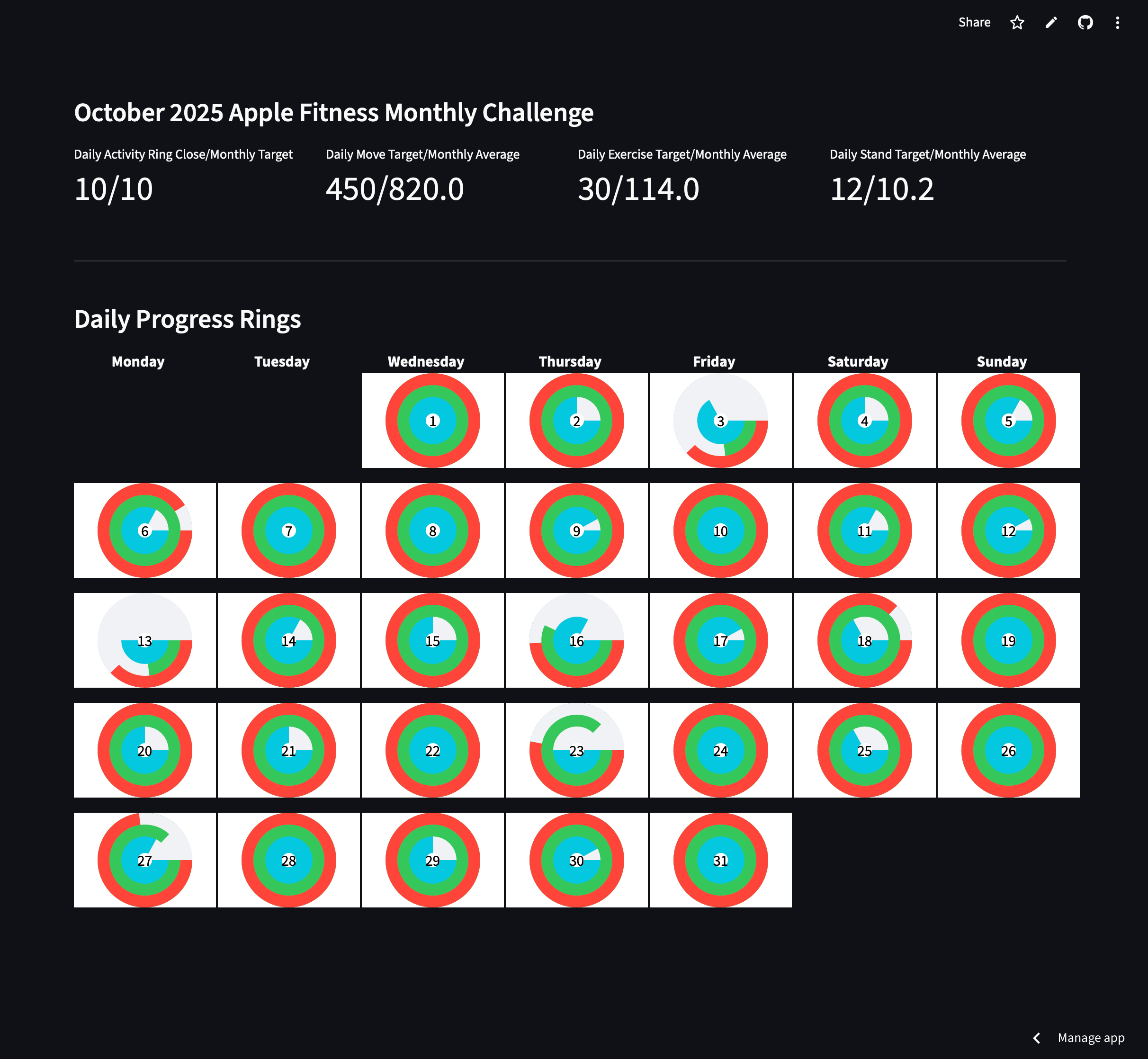
Apple gives watch owners a unique and tailored fitness challenge every month. They typically vary around a few main themes all of which fit around data accessible to me in my health lake. My October 2025 Apple Fitness Plus monthly goal was to close my rings 10 times a month. This is actually a challenge for me (they are all designed to push you slightly) because I frequently lose interest in having a watch on my wrist for the entire day so I put it on a charging stand early evening or even late afternoon which means that stand time from that moment is not counted. In addition I am very often sedantary in the afternoon which I acknowledge is unhealthy and ironic but I am determined to improve this. In addition I am also frequently wearing a Garmin watch for the entire day and it can be a drag to be wearing so much wrist ornamentation during so much of my waking hours. The point of failure for this goal then is stand hours. I can easily get more than 30 minutes exercise time a day and 500 calories or so of energy expenditure. For the entire time I have owned my Apple Watch I always dismiss the notifications about calibrating energy expenditure rings upwards because it seems too mentally stressful to fall in to that Sisyphean treadmill.
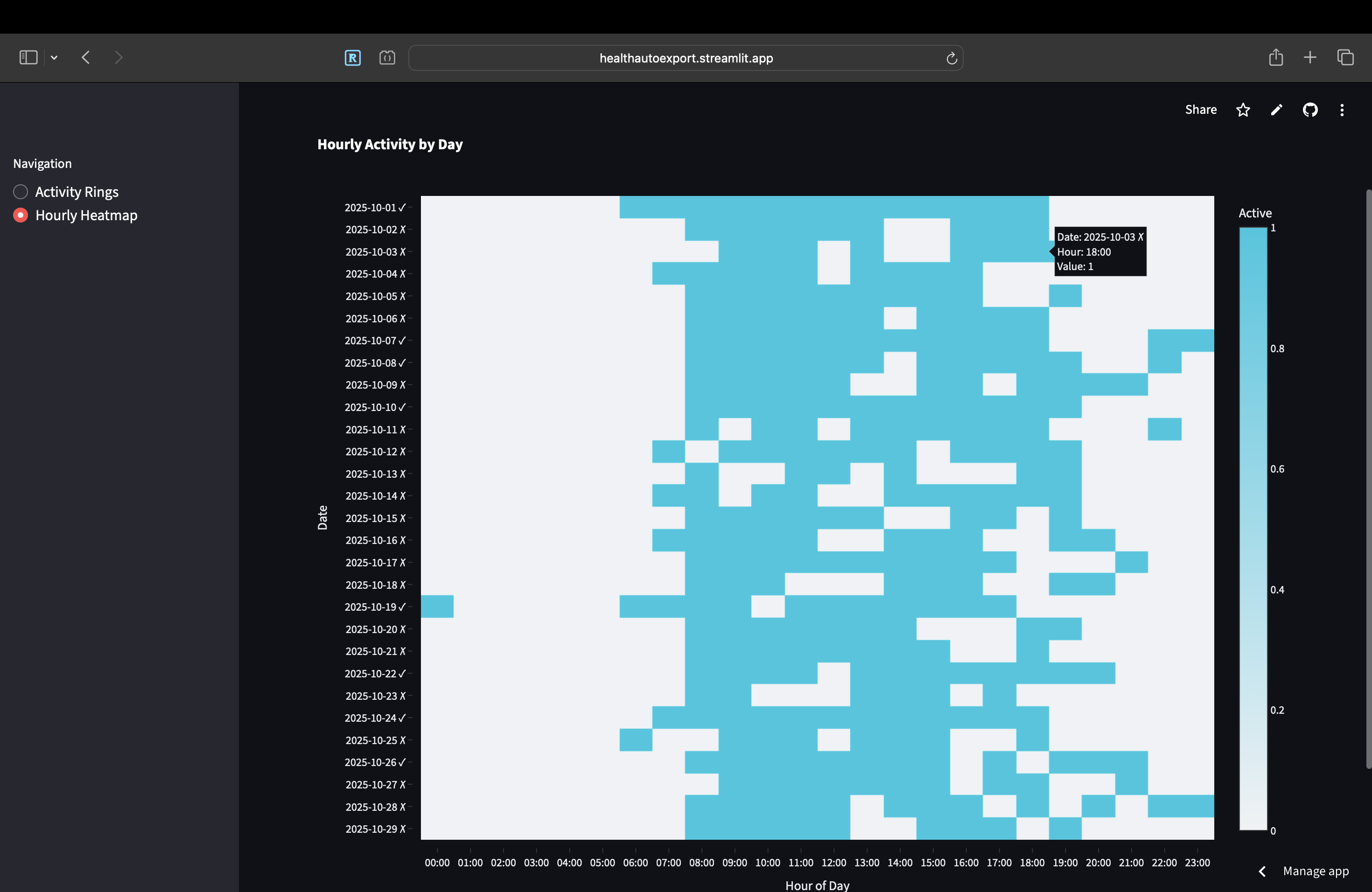
The result is that in addition to a basic ring dashboard similar to what you can get by navigating to the iOS app I created a binary heat map that lights up the hours on a 24 hour axis for each day when I succcessfully stood.
 My Fitness Rings
One thing I learned in the process of making this that I didn’t know before but seems obvious now is how much effort Apple puts in to making their animations so smooth for the ring animated graph. I tried animating my rings in a Streamlit dashboard and it was a buggy mess. This static and somewhat ugly chart is the best that I could do with the amount of time I wanted to spend on this.
 Heatmap of Laziness
I genuinely feel like my Apple Health stand dashboard helped me accomplish my monthly goal as the clocks approached midnight before November 1 2025. Before the month completed I was able to derive insights and dynamically adjust my habits to nudge myself to have a better likelihood of success. I cannot see hourly stand information in the native ios so I do not know on a granular level what it typically looks like when I fail to meet my goals.
Strava
What motivated this was my mistaken belief that Strava paywalls historical workout data so I wanted to be able to have something I can use for my own workouts for once my Strava premium runs out. Instead Strava paywalls workout trends but who knows if this might change in the future given their recent anti consumer decisions. Now more than ever I feel it is of utmost importance for people interested in fitness data to self host analytics as the major platforms mature and look to squeeze value out of users. This dashboard therefore serves no purpose other than what I can get from my workout activities right now and if I am being honest if I would do it all again I would rather not. Just like with Apple there is a tremendous amount of work from Strava put in to attention to detail here which makes this a pain to try and reverse engineer. However it makes more sense for this dashboard to be shared than the other one because it at least changes dynamically whereas the other once the month is over is stuck forever.
There are some disclaimers to make at the outset. While Garmin data collated for Strava dashboards is recorded at 1hz frequency or every second the workout data from Health Auto Export for some fields is every minute. According to the developer on discord this is a bug that may be fixed at some future date. It is important to note that some data is recorded every second for example route data featuring latitude longitude pairs. In addition the dashboards between Strava and my own creation will be different because they contain data from different devices from which I manually click start and stop at different times. This is not to mention the fitness data recordings are on different hardware and software. Yet another factor is that Garmin data on the Strava dashboard cleverly does not involve stopped time in workout calculations separating moving time from idle time whereas Apple does not discriminate.
I tried my best to recreate the dashboards in Strava with the data I have from Apple methodically one by one, metric by metric. Some data is not accessible to me like grade adjusted pace. Other data like elevation could have been added but I did not know it was buried in the route section of the fitness file and I had already spent as much time as I wanted to budget on this exercise. Last warning is that all of these dashboards are extremely long and take a lot of scrolling to get through. If this blog was commercial this would be a really good place to insert ads.
Bike
 Bike Workout Dashboard
 Strava Bike Dashboard
Run
 Run Workout Dashboard
 Strava Bike Dashboard
Walk
 Run Workout Dashboard
 Strava Walk Dashboard